Ritzy
BRANDINGRitzy was designed for a company that dealt with luxury barware in India. The central intention was to create a brand identity and packaging that championed the spirit of celebration.
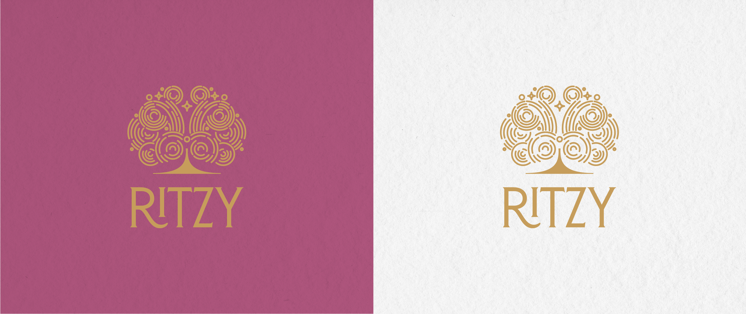
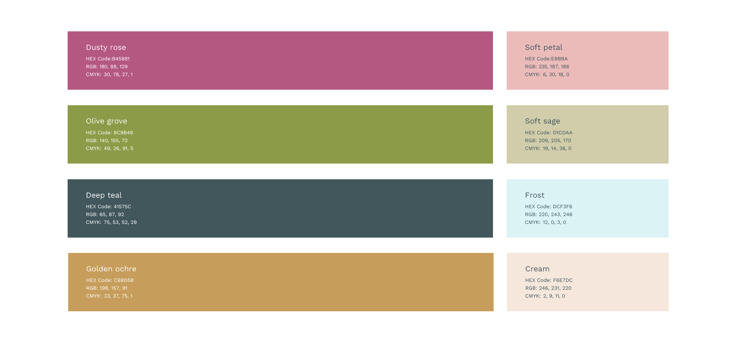
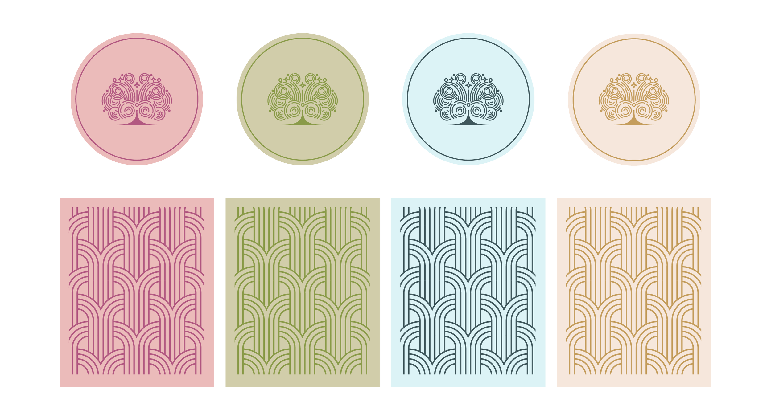
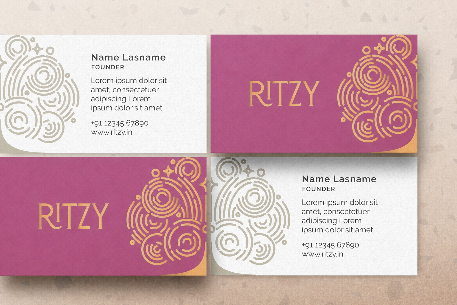
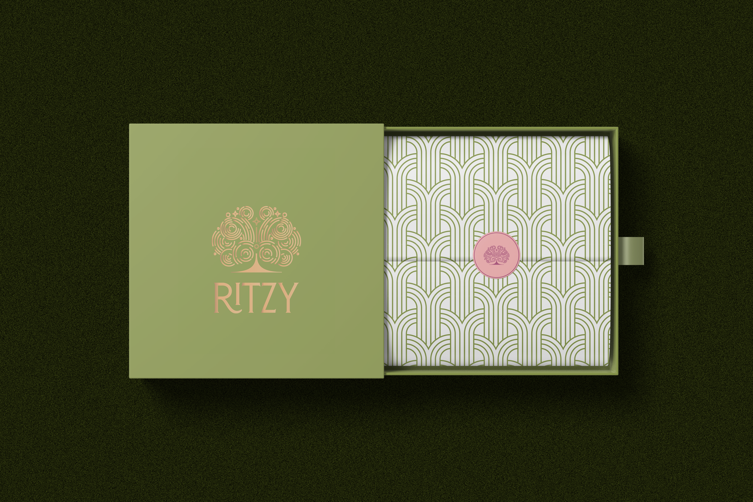
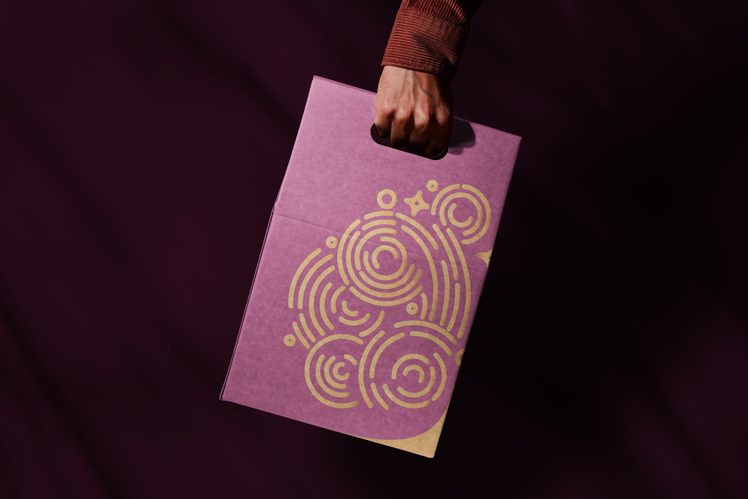
The logo draws inspiration by the effervescence of champagne overflowing from a flute while packaging collaterals and patterns hark back to the Art Deco period- a time known for glitz, glam and irreverence.
Developed with Walter and the Studio, this project intended to build a brand that was polished yet youthful and most importantly fun.

BRANDING
|
ICON DESIGN
|
PATTERN DESIGN
|
LOGO DESIGN
|
PACKAGING DESIGN
|
BRANDING | ICON DESIGN | PATTERN DESIGN | LOGO DESIGN | PACKAGING DESIGN |

The brief
To develop a brand identity and packaging system for Ritzy, a luxury barware company in India, with the central aim of capturing the joy, glamour, and energy of celebration.
-
The luxury barware category often leans towards formality and restraint, which can make brands feel distant or overly serious. Ritzy needed an identity that could feel premium and polished while still being youthful, expressive, and fun.
-
Celebration is both refined and exuberant. For a luxury barware brand, the opportunity lay in balancing sophistication with a sense of play: creating an identity that felt aspirational without losing its warmth or energy.
-
To build a visual world inspired by the effervescence of champagne and the glamour of the Art Deco period. The logo captures the movement of champagne overflowing from a flute, while the packaging, patterns, and collaterals draw from an era known for glitz, indulgence, and irreverence.
-
Developed in collaboration with Walter and the Studio, Ritzy was shaped into a polished yet youthful brand with a distinctive identity and packaging language—one that celebrates luxury through a lens of joy, glamour, and play.